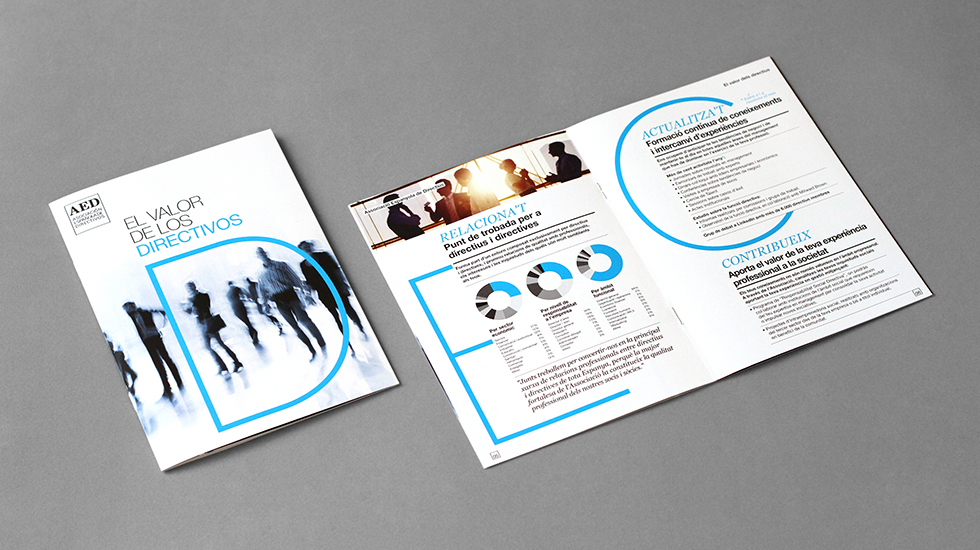
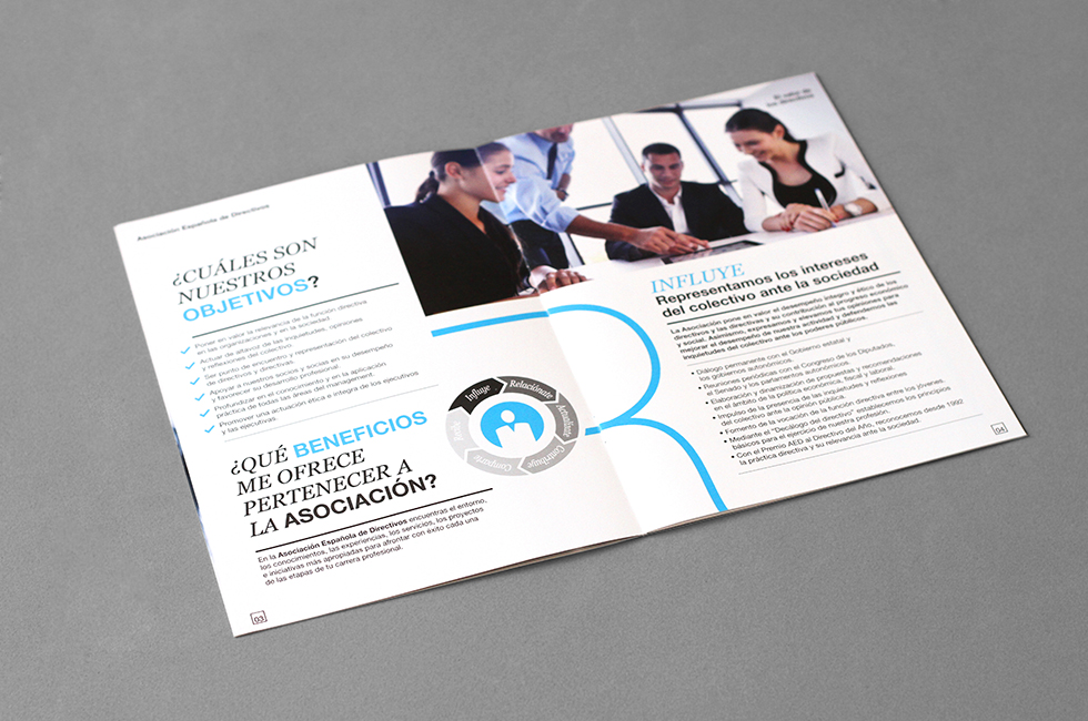
AED needed a suggestive and interesting catalogue that would attract new members. Our challenge was to give value
to the Association´s contents in order to encourage new members to join. We found the solution in the two-colour
graphic treatment, in this case the black and blue used in the catalogue. Furthermore, we decided to structure the contents
by presenting them in a simpler and cleaner way.

Hi there! This is Esben, an elegant photography theme. Are you ready to show your work to the world?


